
Add/Edit Charts
The Create a New Chart screen allows you to build a custom chart by selecting a dataset and choosing a visualization type. To open this screen, click + Chart from the Charts list view. Once created, you will be redirected to the chart editor where you can configure your query, customize the chart's appearance, and preview the results before saving.
| NOTE: Charts are shared objects. When you edit a chart that already exists on a dashboard, your changes will be visible to everyone who can view that dashboard. If you want to experiment without affecting others, use the Save As option to create a personal copy. |
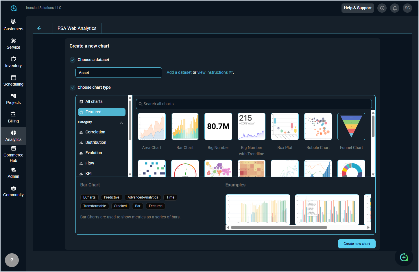
To create a new chart, complete the following steps:
- Select a dataset from the Choose a dataset field. This determines the data your chart will pull from.
- Select a visualization type from the Choose chart type section. You can browse by Featured or filter by Category, or use the search bar to find a specific type. Selecting a chart type will display a brief description and examples at the bottom of the panel. See the Chart Type Options article for more information about the available Type options.
- Click Create new chart to open the chart in the chart detail view, where you can configure your query settings and customize the chart's appearance.
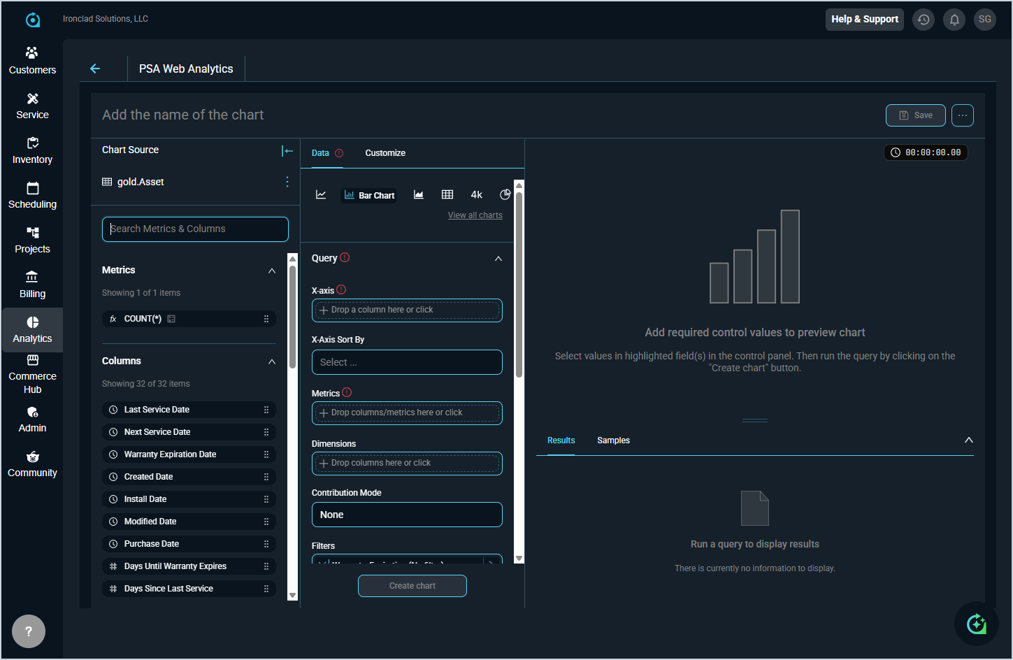
To configure a new chart, complete the following steps:
- Once redirected to the chart editor, enter a name for your chart in the Add the name of the chart field at the top of the screen.
- Drag and drop Metrics and Columns from the Chart Source panel to define what displays on the chart.
- Configure your chart using the Query section in the Data tab using the table below.
- If desired, customize the look and feel of your chart by clicking the Customize tab.
- Click Create chart to run the query and preview your chart.
- When you are satisfied with the result, click Save to save the chart.
The fields in the Query section are defined below.
| No. | Label | Definition |
| 1 | X-Axis | The column used as the horizontal axis of the chart. |
| 2 | X-Axis Sort By | Determines how the values along the X-axis are sorted. |
| 3 | Metrics | The values or calculations to be measured and displayed in the chart. |
| 4 | Dimensions | The columns used to group or segment the chart data. |
| 5 | Contribution Mode | Controls how metric values are displayed, such as showing each value as a contribution to the whole. |
| 6 | Filters | Conditions applied to narrow the data included in the chart. |